
Challenge
Ascentry, formerly known as BYG4lab, stood at a critical inflection point. A leader in France’s laboratory middleware market, the company had recently secured investment from private equity firm Keensight Capital, accelerating its ambition to scale beyond its home market. The investment was swiftly followed by the acquisition of Finbiosoft, a complementary software business based in Finland.
While strategically valuable, this acquisition introduced complexity. Although BYG4lab and Finbiosoft provided complementary software solutions, they were distinctly different in identity, architecture and go-to-market strategy with no coherence to explain their combined power. Visually and verbally, they had nothing in common.
Leadership recognized that to stand out, particularly in the US market, where one dominant player already led the field, they needed more than a simple rebrand. They needed a full-scale reinvention:
- From national leader to global challenger.
- From fragmented portfolio to integrated offering.
- From operational software company to category-defining brand.
Their mission was to consolidate both businesses under a single, cohesive brand and position themselves as a serious alternative in a noisy, competitive category.
Idea
What looks calm on the surface of a laboratory disguises a complex environment of instruments, data, workflows and technicians working together. They must work seamlessly together to deliver high quality, precise results that provide a confident patient diagnosis. But often results lack accuracy. Labs are held back by legacy systems and complex workflows, while instruments and data don’t easily interface with each other.
Our creative idea, Quiet Symphony, captures the unique role Ascentry software plays – orchestrating data from across laboratory instruments, operations and workflows to bring harmony to the lab – creating a quiet symphony of instruments, data and technicians, and reducing complexity so that labs can operate with clarity, precision and confidence.
The new name Ascentry emerged from this idea, reflecting the essential role software plays in the diagnostics process: identifying and elevating the most important data and bringing it into sharp focus.
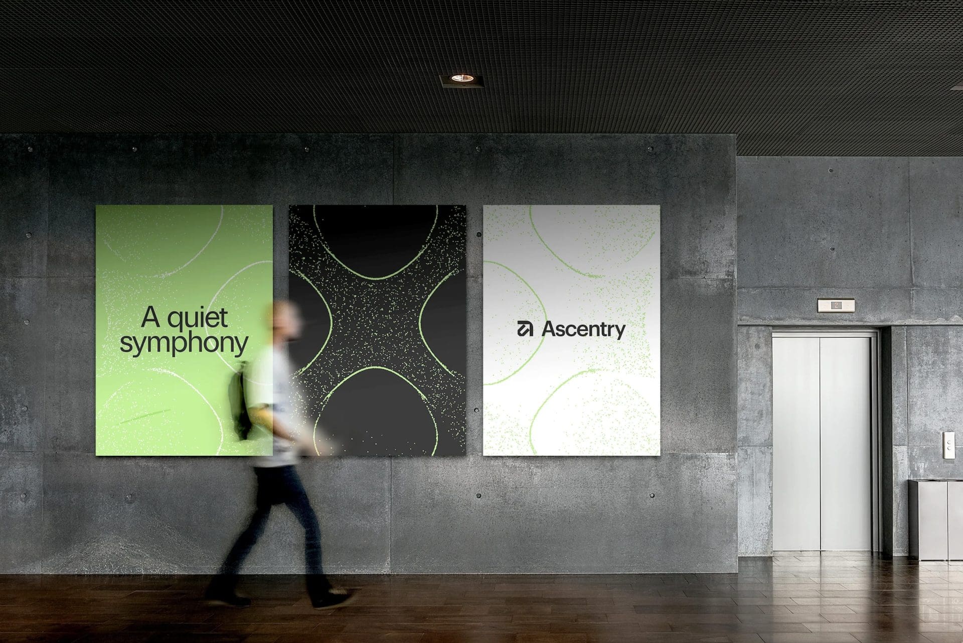
To bring Quiet Symphony to life, we designed a visual identity system that captures the unseen harmony behind lab performance. At the heart of this system are Chladni patterns – a scientific phenomenon where sound frequencies form intricate, geometric patterns in particles. When in tune, these invisible frequencies snap into beautiful, ordered forms. This was our inspiration and metaphor.
Impressive work. The site, the messaging, the visual identity will resonate with the US healthcare market. I genuinely believe this will turn heads fast in the US market. Let’s go turn some heads. Can’t wait to represent it proudly.
Tim Bickley VP Sales US, Ascentry
Making the invisible visible
To express Quiet Symphony between instruments and data visually, we set out to show what is usually unseen: the silent precision, the hidden beauty, the quiet intelligence that sits at the heart of modern diagnostics. Invisible energy, made visible.
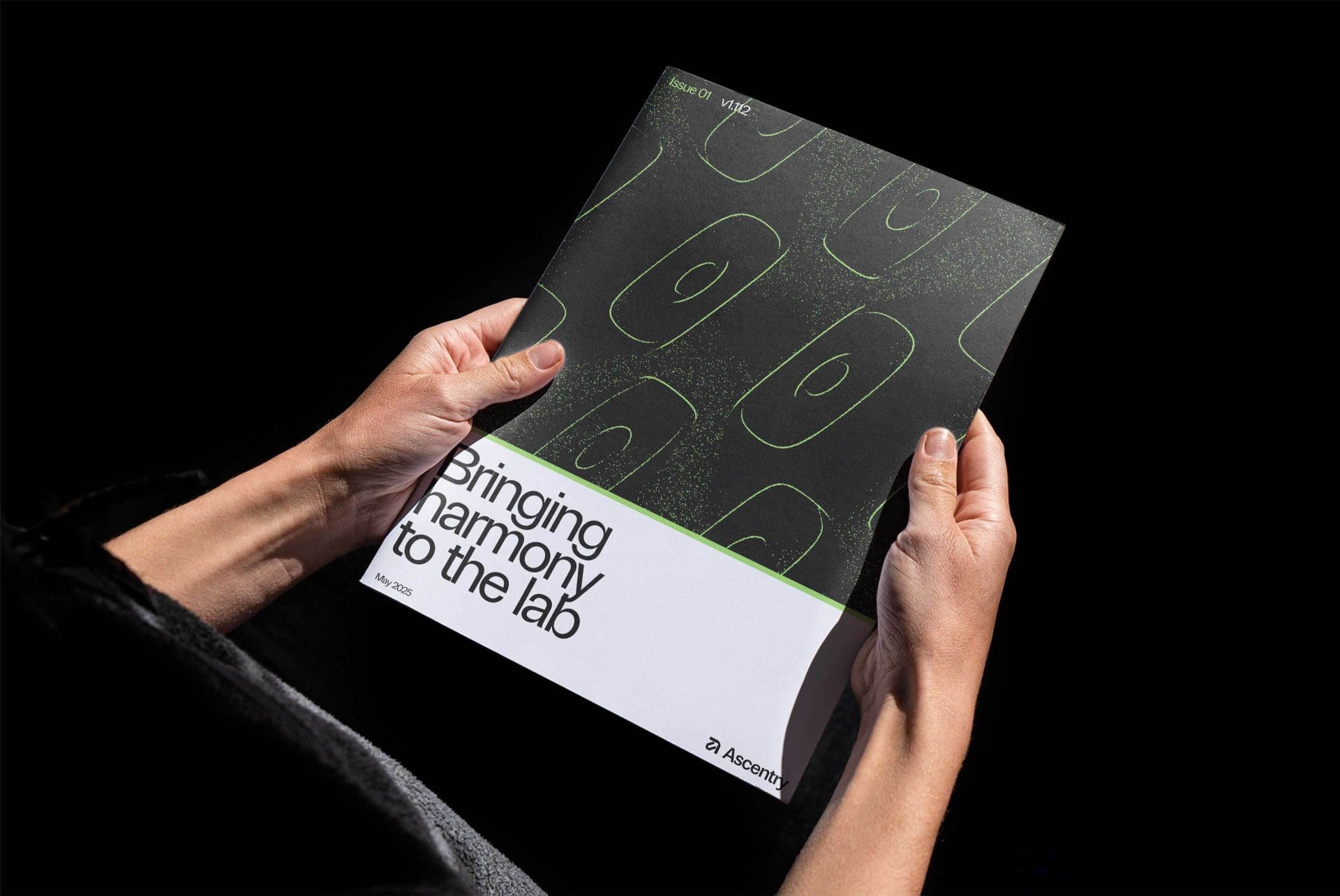
Using a custom-built program, we generated our own Chladni patterns to symbolize what Ascentry does: connect, align and orchestrate machines and data to create clarity, calm and control.
Each pattern is unique, just like the results labs produce every day. Yet all share the same underlying truth: when things work together in harmony, beauty emerges. These elegant, cellular-like visuals convey:
- Invisible intelligence – the silent coordination behind lab success.Scientific precision – many of the patterns look like cells under a microscope, giving a nod to lab environments and biological forms.
- Emotive clarity – patterns that look calm, confident, and credible.
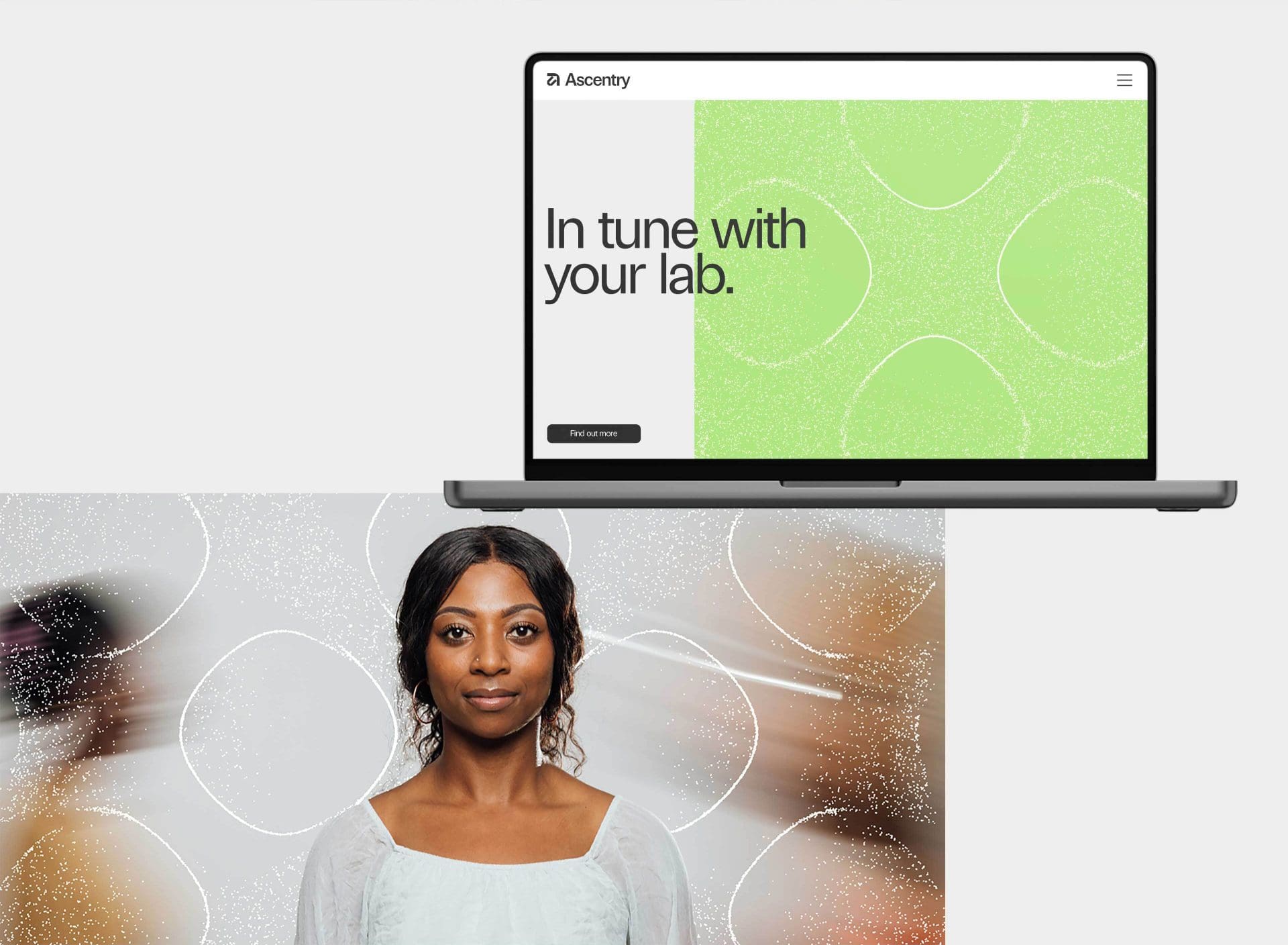
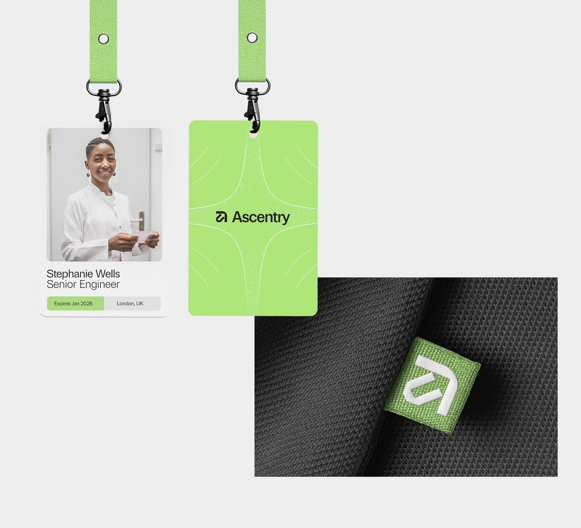
To set Ascentry apart in a sea of sterile, blue-washed competitors, we chose a bold, confident shade of green for the brand’s primary color pallet. Green is the color of balance, health and signal clarity. It feels fresh, distinct and calming yet unmistakably modern. In a world of cold, corporate sameness, green lets Ascentry feel human, intelligent and quietly radical.
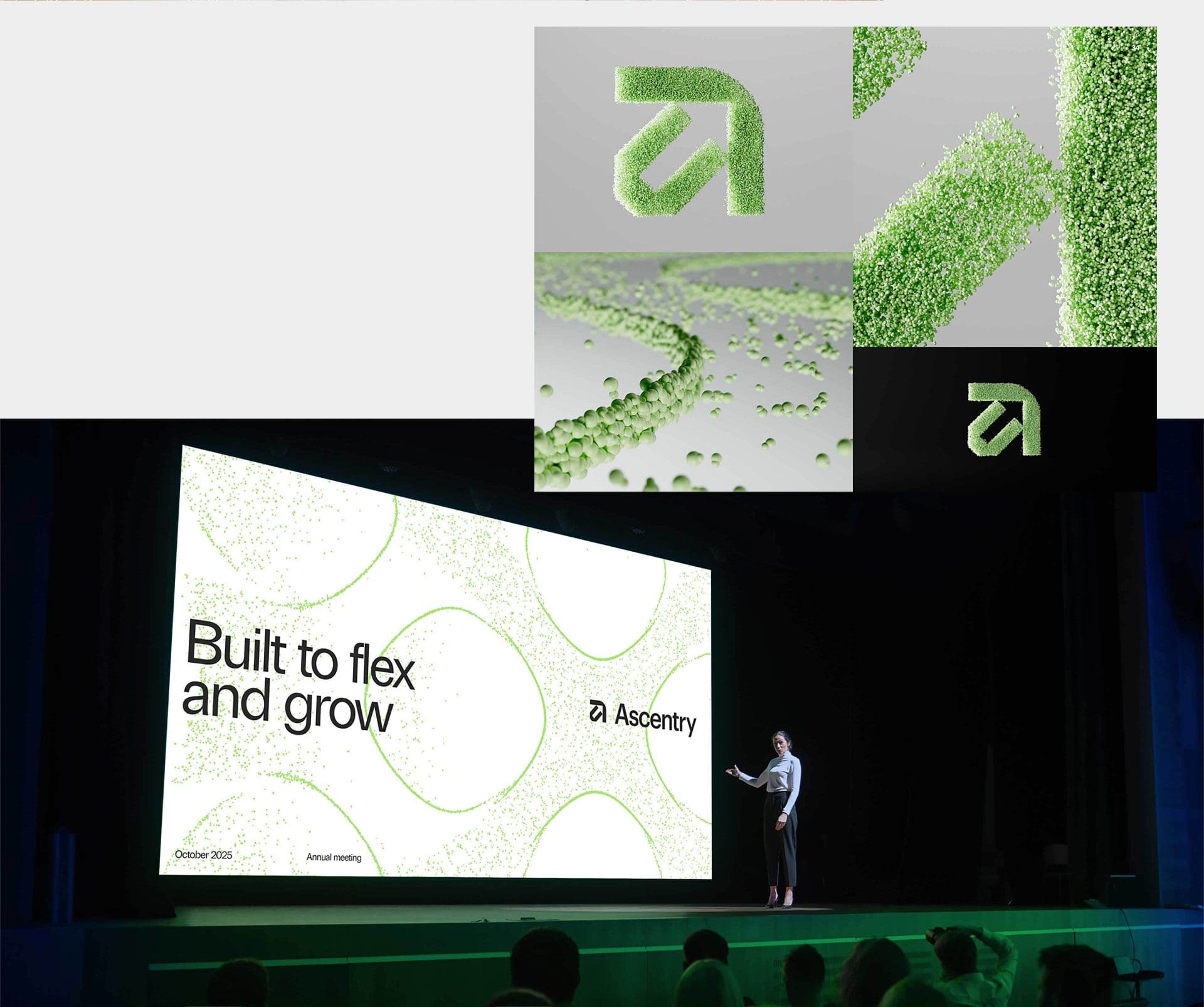
Likewise, the logo carries a quiet sophistication. A modern, technical wordmark with a subtle upward arrow hidden in the letterforms – a nod to “ascend,” to clarity, to pinpointing the results hidden in data .
This entire, from concept to crafted design system, was created in under three weeks. With tight timelines, our team engineered a bespoke brand and visual world with agility, ingenuity, and empathy.
Reimagining a brand for growth
We delivered a complete brand transformation:
- A unifying brand strategy and architecture that consolidated BYG4lab, Finbiosoft, and product brands under one name.
- A striking visual identity that signals clarity and composure.
- A bold, human verbal identity rooted in calm confidence.
- A digital presence designed to engage global audiences and support expansion into the US.
- A clear, confident investment narrative to signal ambition and scalability.
Most importantly, we helped Ascentry show up as a trusted partner at the heart of lab performance.
Related work

